Drawstring Bag of Many Projects
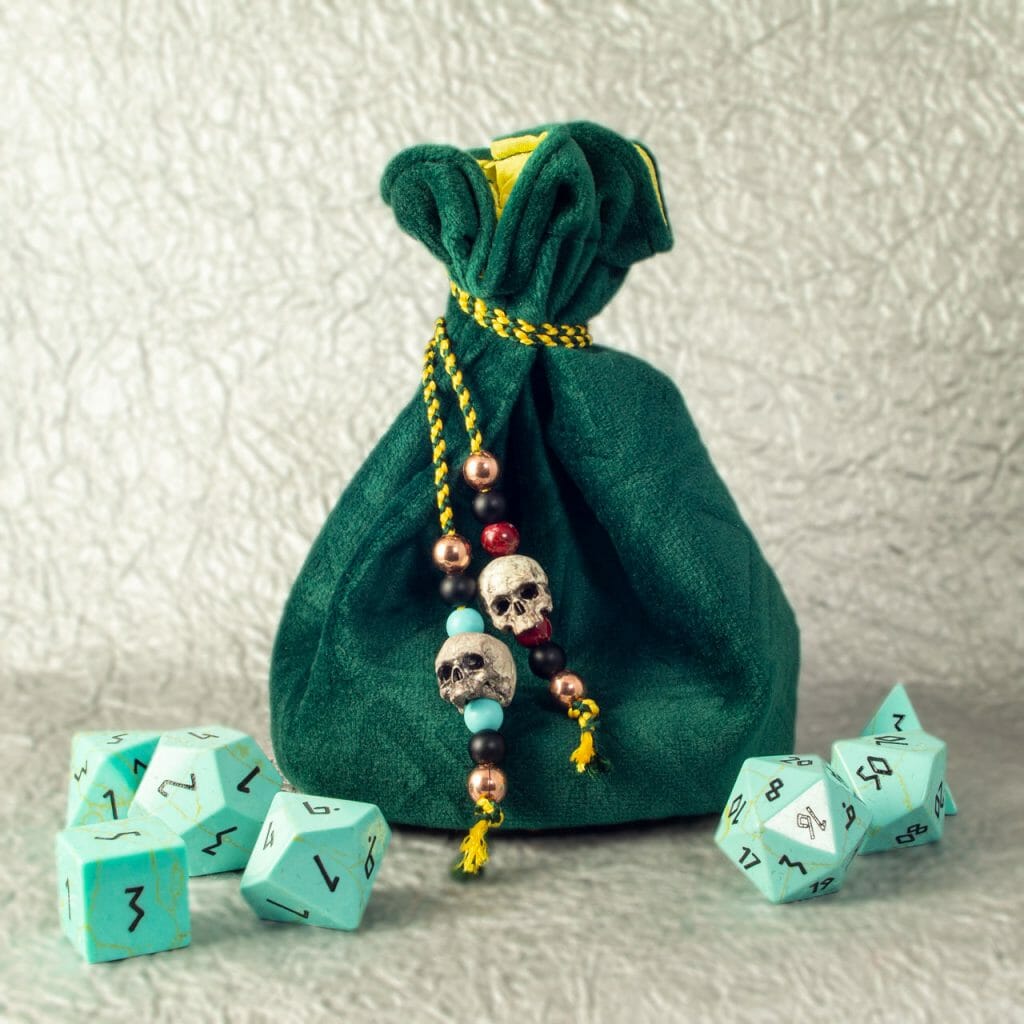
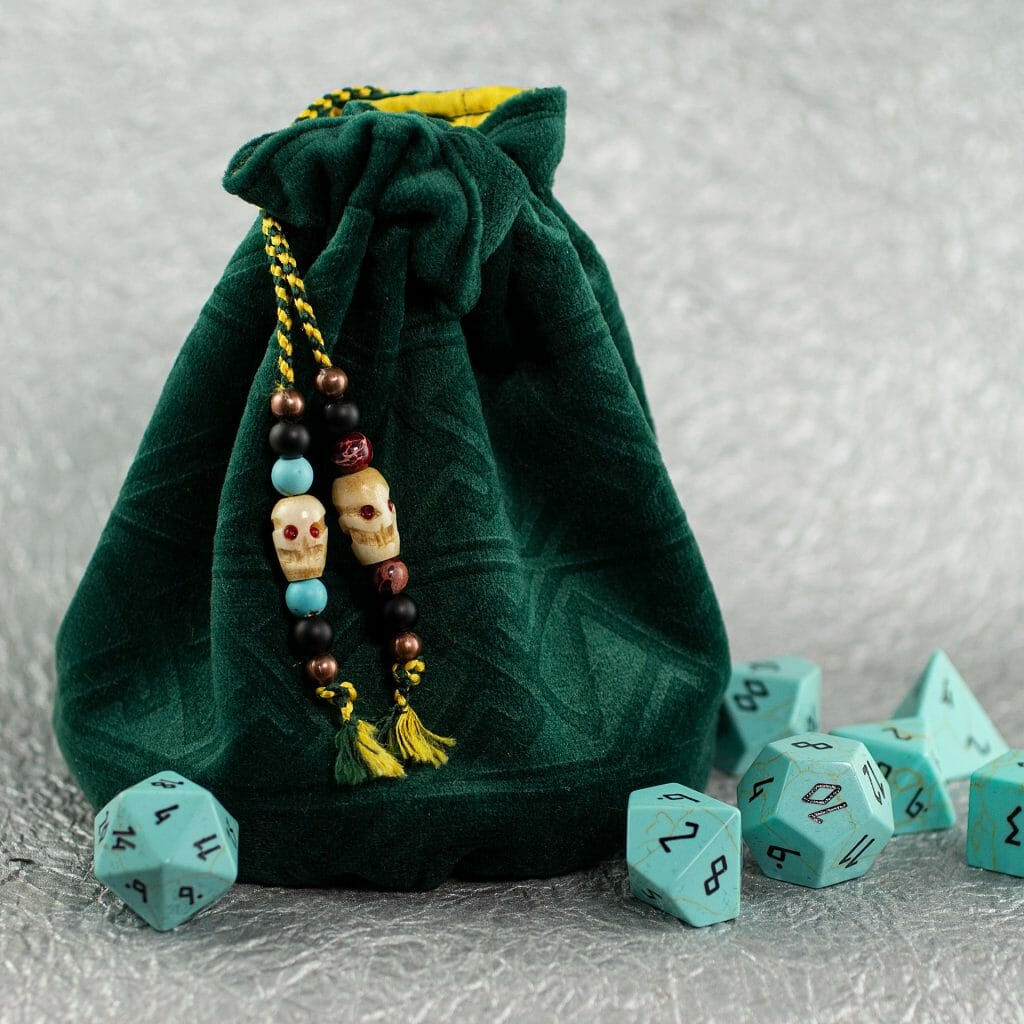
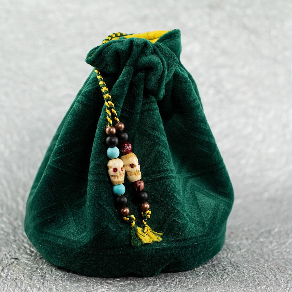
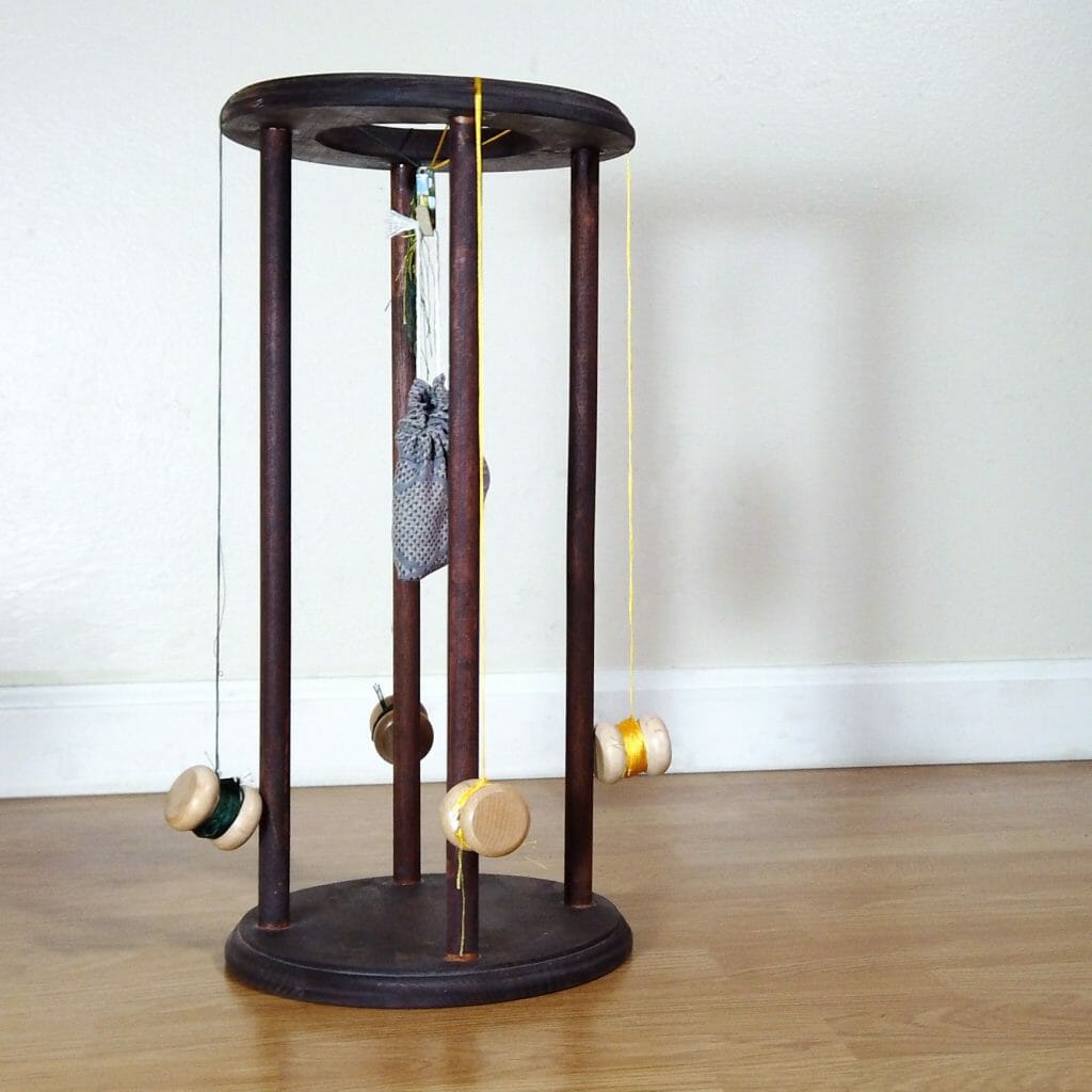
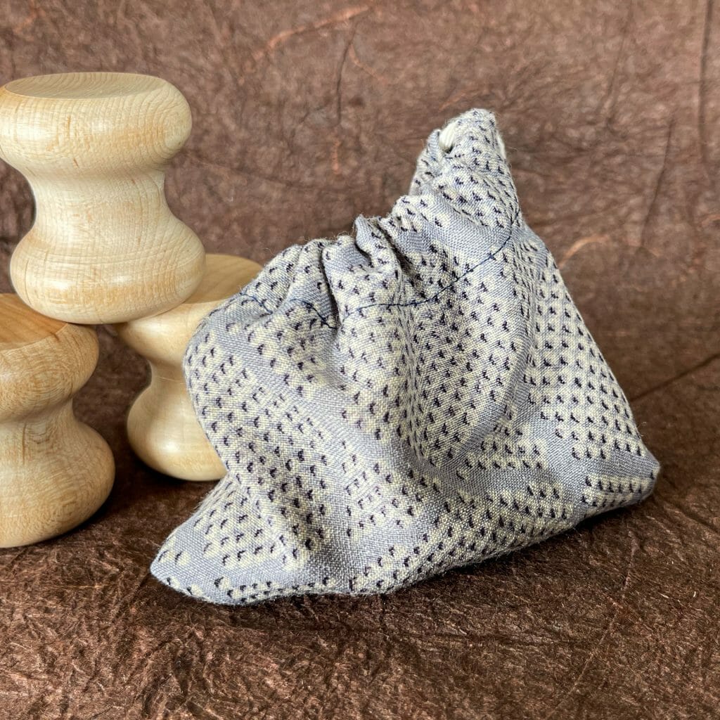
I have a fair amount of custom-embossed Celtic key pattern velvet left from the pillow project. I was thinking some of it might make a cool drawstring bag. I may have gotten a little carried away with the details:
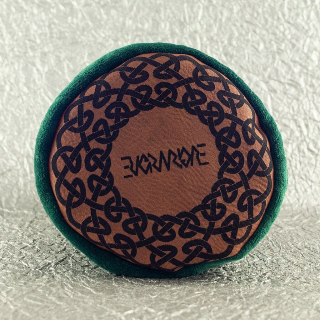
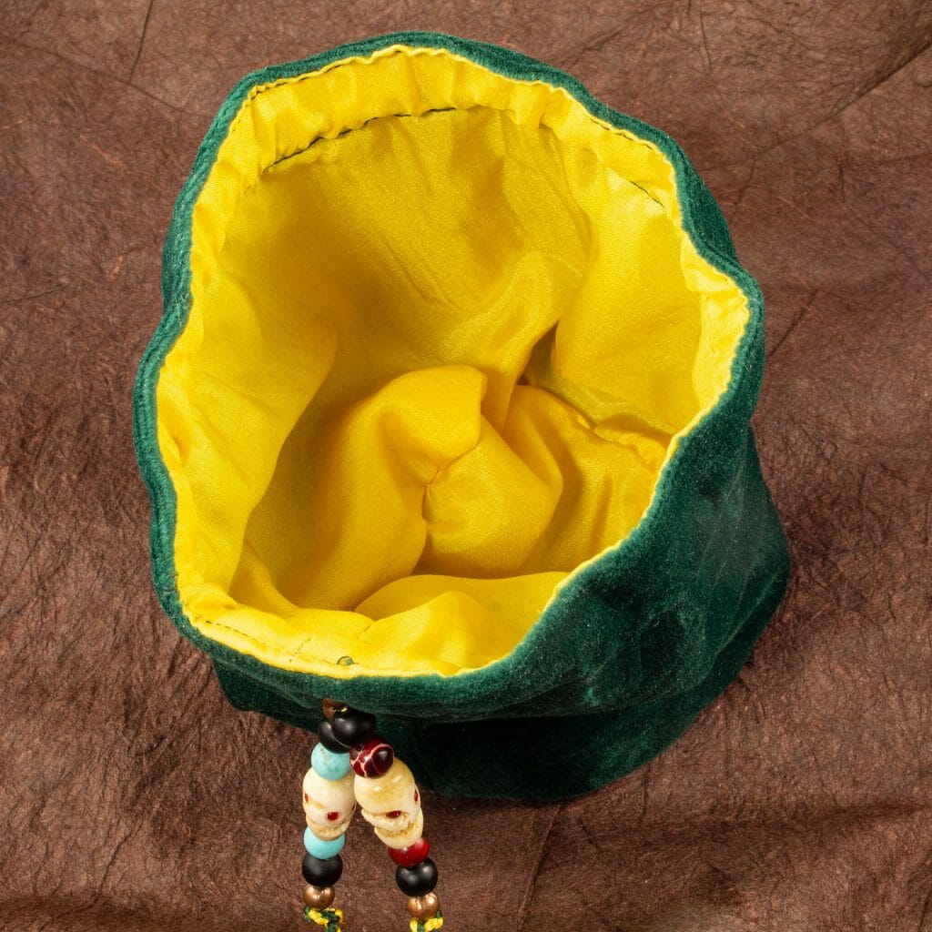
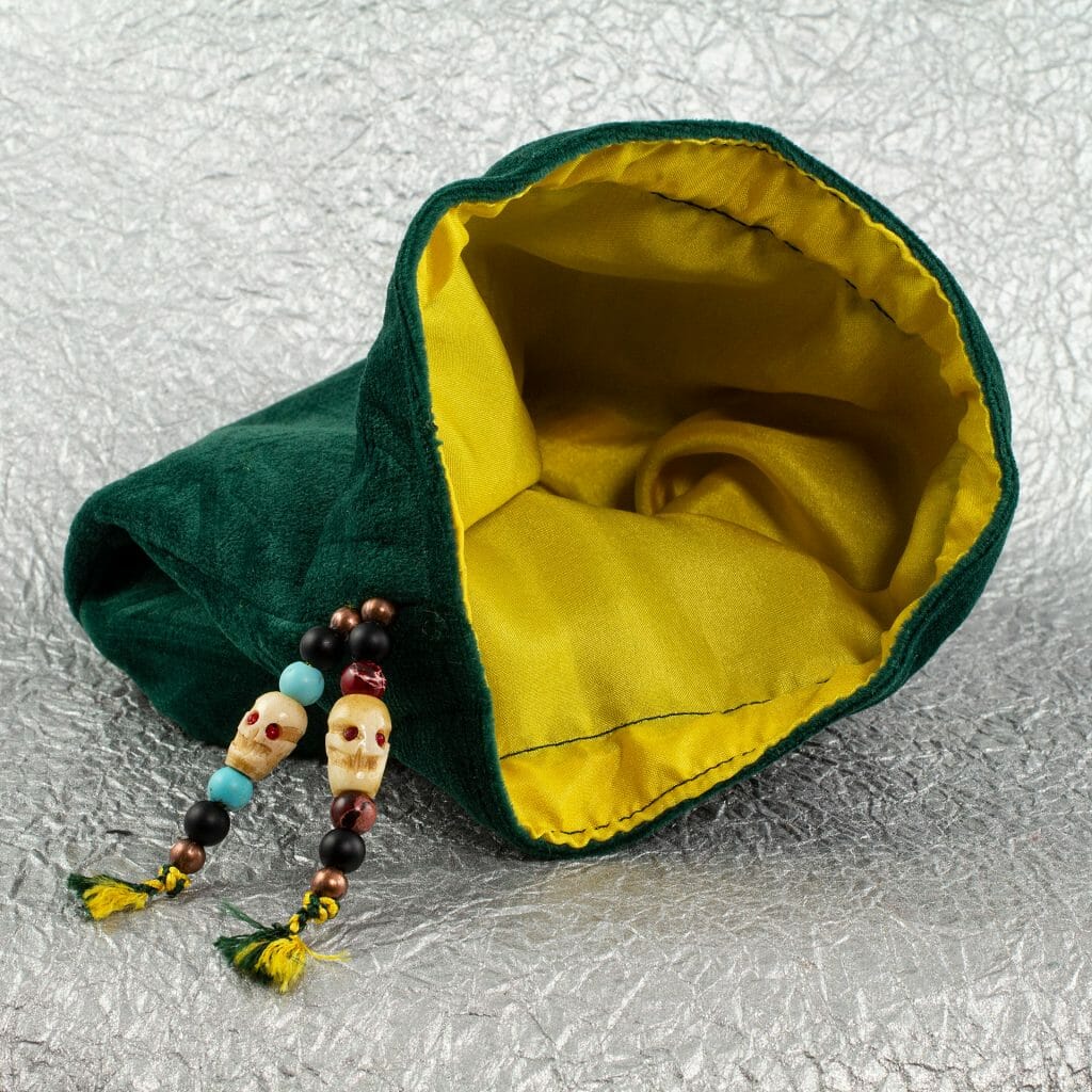
- Silk-lined round-bottom bag
- A new Celtic knotwork ring design for a laser-engraved faux-leather bottom
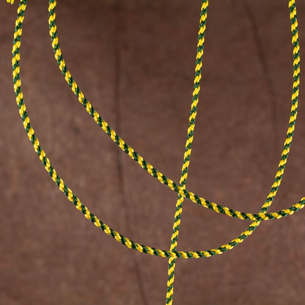
- Kumihimo braided drawstring
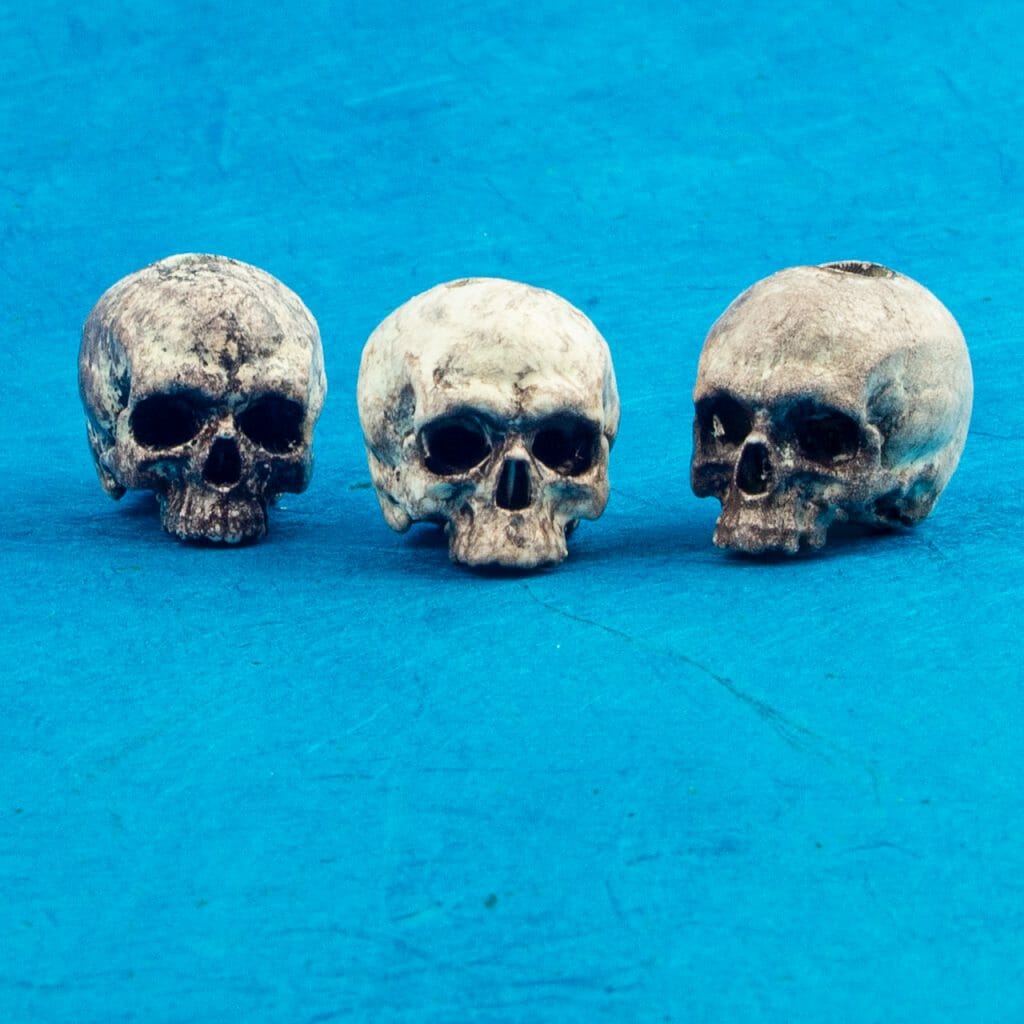
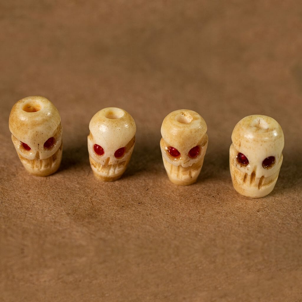
- Customized skull beads
- Second set of skull beads from scratch
There is a separate post with the design files for the floss separator I made for this, in case it is of use to anyone else.
It was a lot of fun and, I’m happy with the result. Of course, I shot video of every step of the construction of both versions of the bag.
Floss Separator
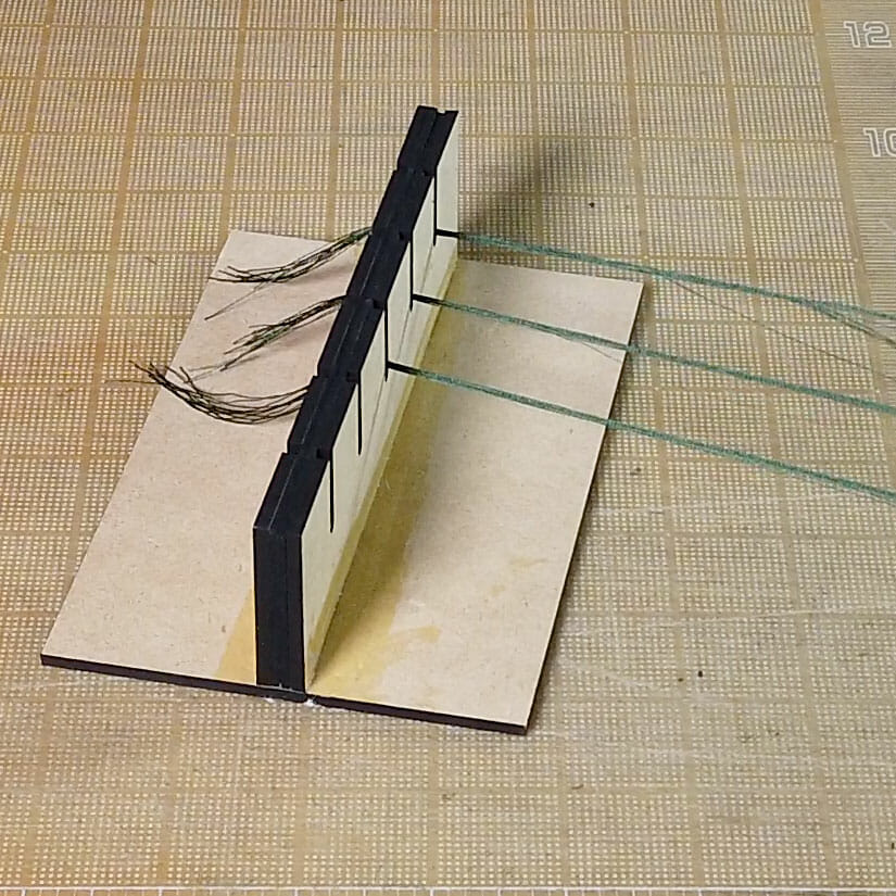
This is a quick, simple tool to assist when separating skeins of kumihimo (or embroidery) floss into working clusters with the desired number of strands. The upright is a sandwich of a piece of EVA foam between two pieces of 1/4″ stock (MDF here but, something like Baltic birch ply or acrylic should work, too). The EVA is sliced with a razor blade in the middle of each channel. Then, just glue it all together with wood glue. Some clamping is likely required while it dries.
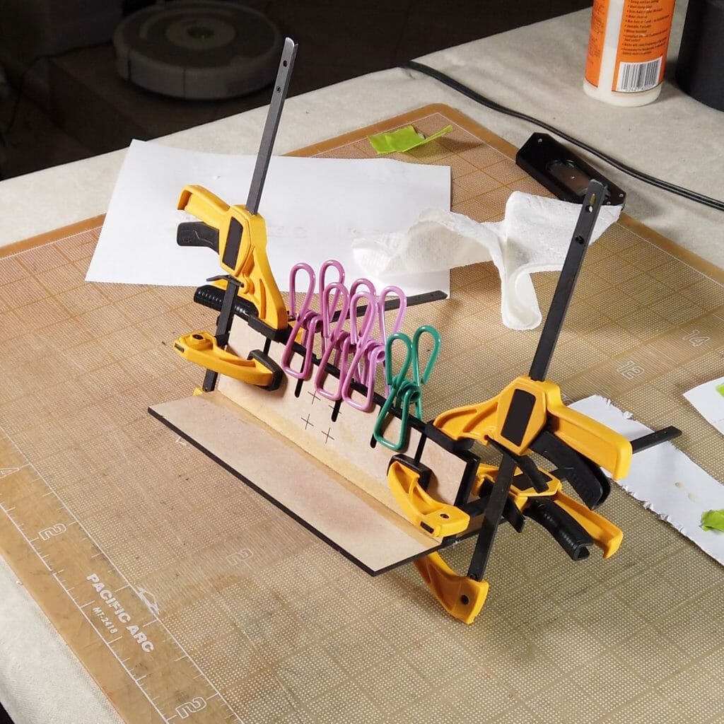
It is probably best to clamp it down to a table when using. Knot the end of the skein/bundle of strands and, slip it into the cut in the EVA. That should keep the end in place while you separate the full length.
Floss Separator Design Files
These files are for personal, non-commercial use only. Note that, by referencing these, you are agreeing to release any variations you create under identical terms.
Viking Longship Design on Hardcover Notebooks
Let Glue Dry Pop Up Card
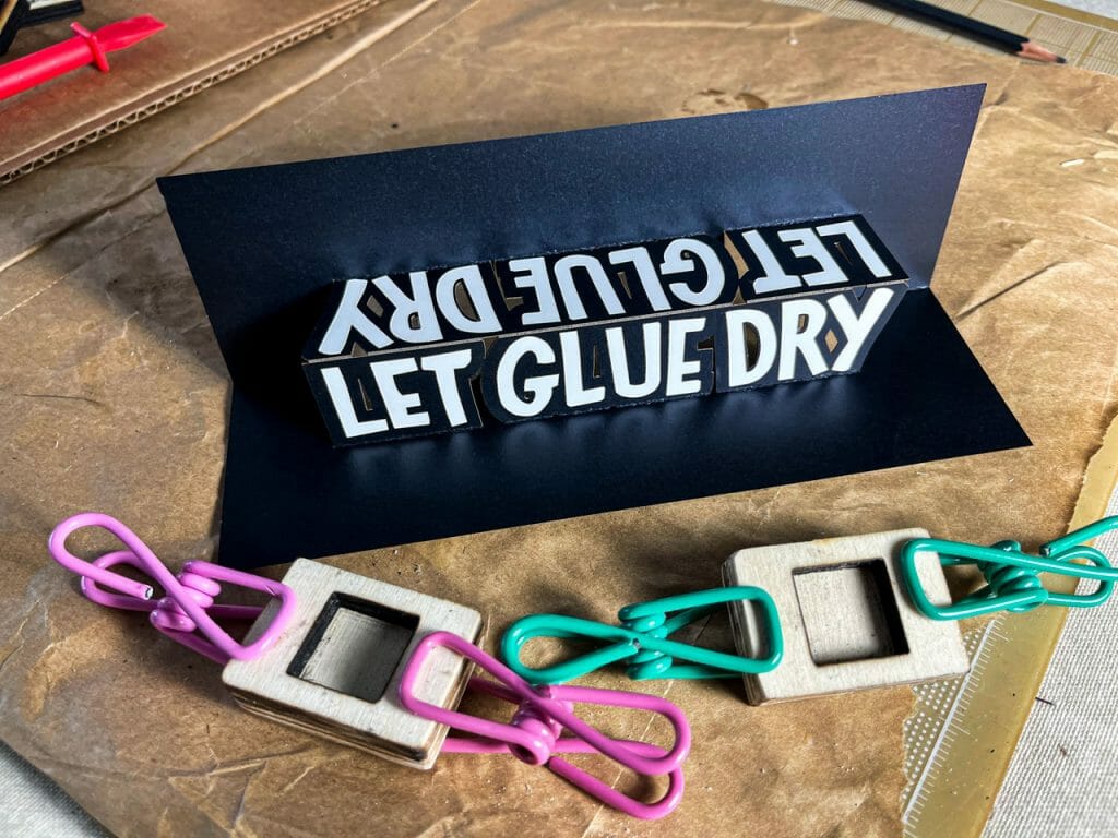
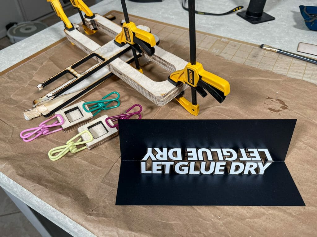
Someone made a paper craft version of the “Let Glue Dry” block Laura Kampf uses in her shop awhile back. I immediately thought of making a pop up card version that could be stored flat. I did one with a simple block font but, later, made another version where I reproduced the hand lettering from a photo of Laura’s block.
I sent one of these to Laura back in March. I am going to assume that it’s okay to share these unless I hear otherwise.
Although I cut my cards on the laser, you could do this entirely by hand with a craft knife. You can even skip the white stickers. The letters could be cut from white paper and glued on. The letters could be colored in with an opaque white marker or paint.
There are two version of each design. The regular one has everything aligned in one image. That is, the score lines for the back show aligned where they should be on the front like a standard OA pattern. The jig-in-place version has the score lines for the reverse flipped for production on a sign or laser cutter.
I made my cards using the jig-in-place technique. In brief, I:
- Stuck the black stock down to an adhesive mat in the Glowforge.
- Disabled all operations except the score lines for the reverse side and the card outline.
- Ran those two operations.
- Flipped the card over in place, aligning it with the hole from which it was cut.
- Placed a strip of white polyester sticker over the face of the card where the white letter would be.
- Disabled the reverse scores and outline cut. Enabled the other operations
- Ran the operations.
- Removed the card and weeded the white polyester stickers.
- Folded the finished card!
I started to make a video of the jig-in-place technique but, it is not super clear on the black stock. I will likely do a video showing how this is done when I have another design on a lighter-colored stock to run.
Files to Make Your Own
These files are for personal, non-commercial use only. Note that, by referencing these, you are agreeing to release any variations you create under identical terms.
![]() LK Let Glue Dry Pop Up Card (Standard version)
LK Let Glue Dry Pop Up Card (Standard version)
LK Let Glue Dry Pop Up Card (Jig-in-Place version)
Personalized Arrow of Light Shelf Plaque
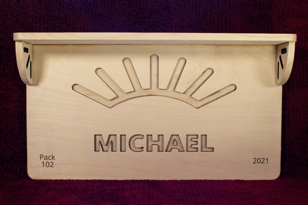
A recent recipient of the Arrow of Light wanted a plaque + shelf to hang in his room for display. There didn’t seem to be anything easily available that fit the bill. So, despite limited experience with woodworking, I agreed to take a run at it.
I did a quick visualization in Fusion 360 but, patterned the parts in Inkscape.
The back is three layers of 1/4″ Baltic birch plywood glued together. The name and sunbeam design are cut through the top layer with additional details engraved in the corners. I put cut-outs in the back layer so the hardware can be inset and, allow for flush mounting against a wall.
The shelf and brackets are two layers of the same plywood, laminated with glue.
My original intent was to use countersunk screws to connect the bottom layer of the shelf to the plaque, then put the second shelf layer over that to create a good mechanical connection. With all of my countersink bits MIA, though, I ended up just using wood glue. A few quick tests suggest the ply will fail before the glue does.
I applied birch edge banding – my first experience with edge banding – to all of the exposed edges for a more consistent look.
This was shipped unfinished so that the recipient can stain it himself to match his room decor.
Make Your Own Arrow of Light Plaque Shelf
If you want to make a plaque + shelf like this, the files are below. Note that there are two files, one for the plaque part and another for the shelf.
The font I used is Open Sans Extrabold (link goes to download) at 144pts. I left it as text in the file. When you have the text/name you want, use the alignment tool in your editing software (e.g., Inkscape) to center it on the sunburst. Then, convert the text to paths (Path > Object to Path in Inkscape).
Similarly, edit the text in the corners as desired, then convert them. Leave them filled to process them as engraves.
Cut three variants of the plaque:
- The front layer with the corner text engraved and the name, sunburst and outline cut out (everything else ignored).
- The middle layer with just the two clusters of three tiny screw holes and the outline.
- The back layer with the cut-outs for the mounting hardware and the outline.
Laminate the three layers together with wood glue, avoiding applying glue to areas that will be exposed.
The shelf is simpler: cut two shelf pieces and four bracket pieces and laminate each set of two together with wood glue.
Glue the shelf and brackets to the plaque as seen in the photos. Edge band, if desired.
Finish (e.g., stain, paint), install the mounting hardware, add the arrow and hang.
Materials
You are almost certainly better off buying your Baltic birch plywood from a local supplier. You can get little boxes of it online but, it is generally twice the price.
1/4″ Baltic Birch Plywood (Amazon)
Amazon referral links for some parts and incidentals defray IT and hosting costs for a local arts organization (Arizona Aikido).
Design Files
These files are for personal, non-commercial use only. If you want to produce these to sell or for other business use, please contact me to arrange for licensing terms. Also note that, by referencing these, you are agreeing to release any variations you create under identical terms.
Color-Cycling Glowforge Logo Hex Panel
After a very successful Glowforge forum Regular community build of a pentagonal hexecontrahedron last year, we decided to do another community build this year. For this year’s project, we all contributed hexagonal panels intended for a reconfigurable wall art installation. My piece projects a color-cycling Glowforge logo through a layer of LED-translucent black acrylic. Here is a gallery of images with the colors in various states and, a video showing how I made it.

